Alan's Overview Tour Part 3
ALAN HULL TV
"Charting Techniques"
By Alan Hull
I find that whilst most people who are even just a little bit curious about the stock market possess a rudimentary knowledge of fundamental analysis (the interpretation of financial data), there are quite a few who have virtually no knowledge of technical analysis.
Technical analysis is simply the study of price charts (as opposed to financial data) and having a basic understanding of both forms of analysis is almost essential in this modern technological age of investing. So here are some very basics of technical analysis, colloquially known as charting.
Familiar with the basics? Jump ahead...
For those familiar with the basics please jump ahead to a video playlist of my favourite charting techniques that I use in ALAN HULL TV - my video newsletter. This newsletter comes out weekly and discusses the broad market as I see it, my stock picks for the week, and analysis of trade suggestions that subscribers have sent in before the show. Anyway, on to the basics of charting.
Price versus Time
What we are looking at when we study a price chart is the change in price over a given period of time. Hence the vertical scale on any price chart is the price of the instrument in question, while the horizontal scale is time. The following chart of BHP Billiton showing slightly over 12 months of weekly price activity is a typical example of the sort of chart you would see in a newspaper or magazine and is the simplest form of price chart.
Line-on-close weekly price chart of BHP Billiton
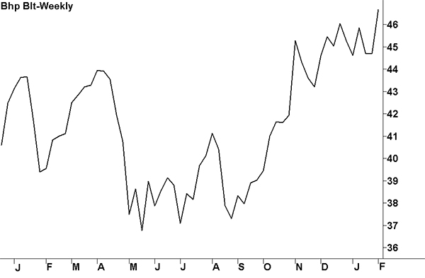
This chart is called a line-on-close chart and is created by drawing a line connecting the weekly closing prices of BHP Billiton (BHP) during the period shown. The closing price is considered to be the most important piece of price information but there is more to this picture than what we’re seeing here. There is in fact four individual bits of price information and they are;
- Open - the price the market initially trades at when it first opens
- High - the highest price the market trades at during the trading period
- Low - the lowest price the market trades at during the trading period
- Close - the last price the market trades at just before the market closes
Note the use of the word market in the above explanation; in this context I am using it in its generic form. In other words I may describe the buying and selling of any individual share or financial instrument, such as BHP Billiton, as a market, or I may use it to describe the stock market as a whole. Whichever the case, it should be reasonably obvious what I mean from the context in which I am applying it.
OHLC Bar charts
Probably the simplest way in which to display all four bits of price information is with the aid of the OHLC bar chart, where OHLC is shorthand for Open, High, Low and Close.
Typical OHLC bar chart where each bar represents a single trading period
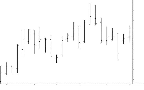
In the above chart each trading period is represented by a bar that has a tick to the left of the bar and another tick to the right. The top of the bar and the bottom of the bar represent the price range of a given trading period (i.e. the high and the low) whilst the tick to the left of the bar is the opening price and the tick to the right represents the closing price. All fairly straight forward and as I said; probably the simplest way of displaying all 4 bits of price information.
Candlestick charts
Let’s now move on to the style of chart that I most prefer using, after nearly 30 years of share trading: the candlestick chart. Candlestick charts are so-called because they use a single candle for each trading period and I personally find them, visually, very easy to interpret. The larger section of each candle is called the 'real body'. The thin parts on the top and/or bottom are called 'shadows'.
White Candle
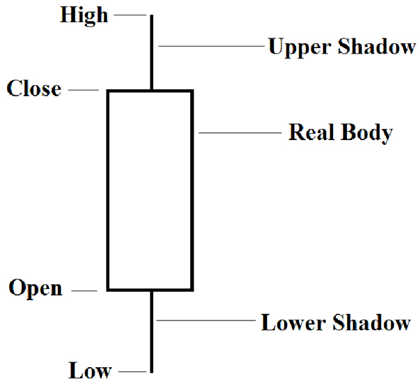
Black Candle
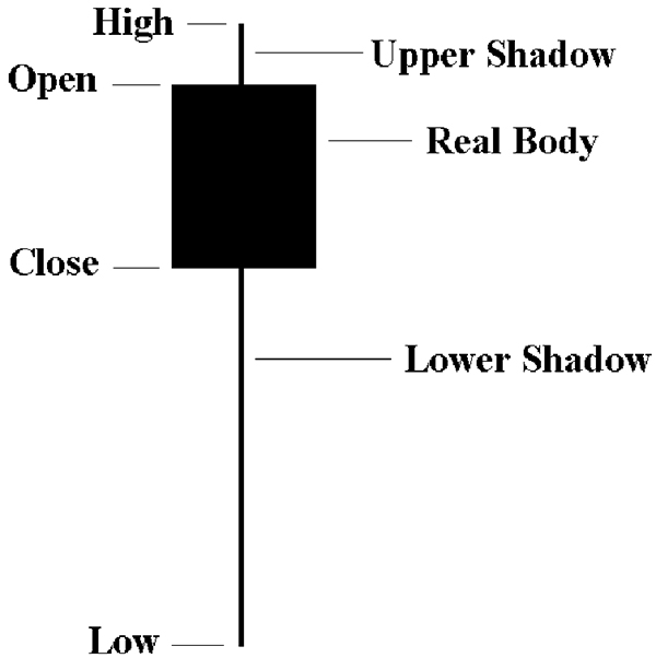
Candlestick charts originated in Japan and have been in use for several centuries. There is a vast body of material on how to interpret these charts, including a wide variety of names for the different shapes of candles that can occur.
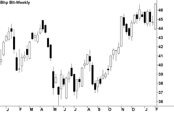
Anyway, let’s now go back to our 12 month chart of BHP but this time let’s use candlesticks. Compare this chart to the earlier 12 month chart of BHP and you can see how it relates far more information. Note how the rising price activity is made up mainly of white candles whilst the down trends are dominated by black candles.
Candlestick chart of BHP Billiton
Trading Volume
There is one more primary element that we can also include when analysing price activity and that’s trading volume. Trading volume, as the name implies, is the number of shares traded during any given trading period…not to be confused with the value of shares traded. Volume is commonly displayed as a histogram (vertical bars) at the bottom of a price chart. So adding volume into our chart of BHP gives us the following chart which conveys 5 discrete bits of information for each trading period.
Candlestick chart of BHP Billiton including volume histogram
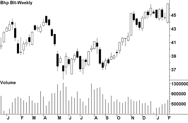
To work out the actual number of BHP shares traded in the above chart you need to use a multiplying factor of 100. This is a peculiarity of my charting program but you’ll find that most charting programs use a similar approach in order to keep the numbers on the vertical scale manageable. It should also be noted that the actual number of shares traded is of less importance than the direction in which the volume is trending.
Charting Techniques - video playlist
So now that we’ve covered the fundamental elements needed to create a price chart, we can delve a bit deeper and look at some of my favourite charting techniques and indicators. To do this please watch the following playlist featuring a selection of Trading Techniques.
Thank you for watching!
We hope you are continuing to enjoy your tour. In the next part we will discuss investing in blue chip shares, the concept behind Alan's most popular newsletter service - The Blue Chip Report. Part 4 will arrive in your inbox soon!
Previous articles in the tour:
- Knowledge is valuable
- What is the stock market
- What is share trading
- Take control with Active Investing
